Thursday, March 6, 2014
The Alnwick Garden

It’s a couple of months since I visited The Alnwick Garden, but I’m still not entirely sure what to make of it.
I suppose I should start by saying that I had absolutely no preconceptions about the Garden, and if we’d had better weather for our week in Northumberland, I might not have bothered going to see it. However, while the rest of the country was sweltering in 30 degree heat, the north-east was sitting under a thick layer of clouds and steady rain, and I was steadily working my way round the regions tourist attractions. As I love castles, one of the first places I visited was Alnwick Castle and as I had nothing better to do, took them up on their offer of a joint ticket to the Castle and Garden.
The first thing you see as you come into the garden is the gigantic, wibbly-wobbly cascade fountain, that appears to have been inspired by a jelly mould. I found it generally displeasing to the eye, and I was also slightly puzzled by what the frenzy of activity around the base of it was. On closer inspection, I realised that these were kids riding around in mini John Deere tractors (I didn’t take any pictures on account of not wanting to be arrested as a paedo). For the life of me, I can’t work out what these two things have to do with each other, and I think this sums up the whole Garden. It’s a series of wacky, “wouldn’t it be fun to have one of those”, that have absolutely no connection or relevance to each other. The Eden Project was obviously the role model for the Alnwick Garden, but whereas the Eden Project has an overarching philosophy of sustainability, hugging trees and generally appreciating the natural world , the Alnwick Garden is just a bunch of unrelated stuff.


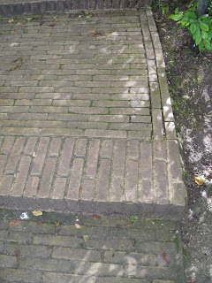
Some of that stuff is actually very fun and inventive, other bits less so. As a landscape architect, and something of a pseud, I have a bit of a problem with the whole design. It feels rather alien, as if somehow it’s been beamed into place, with rows of immaculate, specimen grown trees and topiary - it‘s not awful, but it’s all rather contrived. There is no sense of Northumberland about the Garden, and little of the British Isles. The giveaway is the surfacing, which is a side-laid clay paver that I’ve only ever seen used before in Belgium (yes I know I‘m being spoddy). No surprise then that the designers, Jacques and Peter Wirtz, are Belgian. I can’t help wonder how the garden would have turned out, had it been designed by someone with more understanding of the areas landscape and gardens.

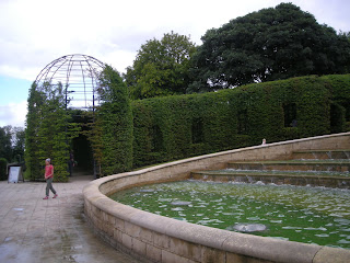
That said, if the brief was to create the most flamboyant garden possible, then the Wirtz boys have had a fair crack. It is without doubt the campest garden I’ve ever visited. You want examples? Well apart from all the fountains and other froo-froo, the backdrop to the main cascade is provided by what I can only be describe as giant, topiary birdcages!


Which kind of brings me onto my second major gripe with the gardens - cost. According to the bumf you get with your ticket, the cost of the garden was £42 million and I can well believe this. Everything looks seriously expensive, from the very tasteful Sir Michael Hopkins visitor centre, to the stacks and stacks of specially grown trees. The worst offender by far though, is the aforementioned topiary birdgcages, which must have been astronomically expensive. They’ve been formed by training hundreds and hundreds of specially grown hornbeam trees (minimum cost £200 each I’d suggest) over a giant pergola, to create… actually I don’t know what they were meant to create. There’s not an awful lot going on inside them at all, as I think my photo’s show. My point is that if you’re going to spunk a shed-load of cash on something, I think that it really ought to have some sort of purpose (as it happens I found them reminiscent of the Hiroshima dome). Similarly, someone should have reminded the person that ‘designed’ the Cherry Orchard, that simply specifying hundreds of the most expensive trees you can find, won’t necessarily give you the best result.

Ok ok, I’m being really critical and in fairness most of the punters I saw seemed to be really enjoying themselves. There is lots that good…
The liberal use of water features is pretty cool. I know it’s easy for designers to get a bit sniffy about this, but the public loves a good fountain, and the Alnwick Garden certainly delivers them. There are big water features, like the main cascade, but the little riffling channels that run through the gardens are a really nice touch. I particularly liked the circular pools, which sit behind my favourite giant topiary things.


The visitor centre is very pleasant, and serves nice sandwiches in a setting that’s reminiscent of the Eden Project. Oh and the loos are amusing too, with different coloured led’s for you to aim at.


The Poison Garden is a fun idea (yes a garden full of mildly to moderately poisonous plants, located behind big gates marked with a skull and cross bones), if only one suicidal teenager away from disaster! I can see the Daily Mail headline already.

The formal gardens located in an old walled area, are nicely laid out around a structure of fountains and channels. At present the perennial planting is a bit disappointing, but hopefully they can develop this with time.(p.s. The rose gardens are a bit dull)


In particular, I thought the Bamboo Labyrinth was inspired. Mazes are fun anyway, but the use of bamboo made for a really dense and atmospheric screen.


Finally, I probably ought to mention the water features again, because if you’re under the age of 12 you’re going to love them. The Serpent Garden has a whole bunch of fountains, and the excitement levels of the children is something I’ve not seen since they took the tartrazine out of orange squash.


You see there’s so much that’s fun and positive in the Garden, that I could almost forgive it. And then…
I see the Treehouse.


What in God’s name made them build this monstrosity? Not in Walt Disney’s wildest dreams could he have come up with this. It’s beyond kitsch, beyond fairy’s down the bottom of the garden with Harry Potter - it’s quite unbelievably tacky, twee and hideous. Who is it for? No really, it may look like something that you’d use to decorate a particularly saccharine, 6 year old girls bedroom, but it actually contains a ‘fine dining restaurant’. Who in there right mind thought these two things could go together? I suspect there’s a reason why Gordon Ramsey hasn’t installed an adventure playground at Claridges.

Well there you go, that’s my take on the Alnwick Garden. It saddens me to be so critical, because the idea of building a new contemporary Garden is one I’d support. You certainly can’t criticise the investment, but the taste, or lack of, is at times rather obvious. Theres lots thats good about the Garden and it is in many ways so nearly right, but certain elements seemed to be something of vanity project. Whether this was from the designers or the Duchess patron I don’t know, but someone should have said that certain things just aren‘t right - like putting a classy restaurant in a Disneyfied, treehouse is never going to work. I’ll be really interested to see how the Garden develops, but my advice is that if you want to visit a brilliant, contemporary garden in Britain - go to the Eden Project first.
Subscribe to:
Post Comments (Atom)

No comments:
Post a Comment